🦦
This Computer will blow your legs off and give you a wee surprise under the table OMG must click!
Every so often I go on a tech site, and I'm met with usually one of these, I'm lying, multiple of these problems. It's such an issue that I've decided to make a whole diary entry, and you WILL read it, I will force you to read it and then you'll give me bellyrubs. It's in the otter commandments, and humans have forked it and kept the same rule.
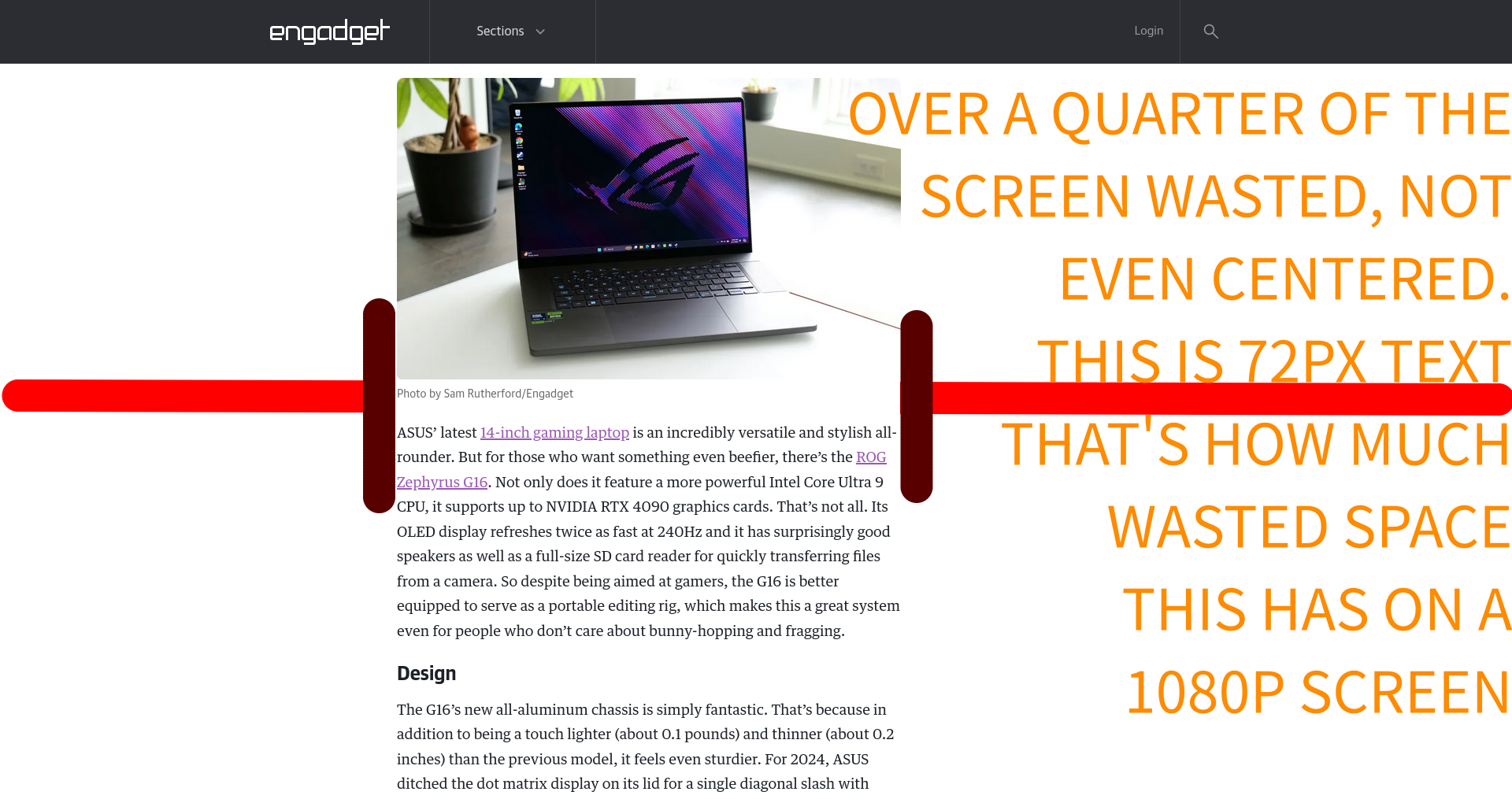
So what issues am I talking about? You might be asking?... Well, where do I even start? Well one, let's start with accessability, let me give an example, of a bad website and let you figure out some: engadget
First of all, this huge "can we pwetty pwease use your cookies for 238 bullshit advertisers to give you target ads", now, this is rejectable, so it's opt-out, cool, but I literally just want to read a glorified text file with a few images, what's the point?
After clicking on the reject button, I wait a pretty good 10 seconds for the website to load, just so you know, I have pretty decent internet and a good enough computer for reading text, thank you, so it's not a me issue. Now, you might be asking, why? Why is it taking so long for what is essentially a word document on the browser. Well, these *not plants* but definitely cognitive plants decided it's a good idea to use multiple thousand-line CSS documents and javascript up the wazoo, I've seen yanderedev make more efficient blogs.
The worst part!? The user experience isn't even better! Want Proof? First of all, more than half the screen is wasted, it's alright to have wasted space, BUT AT LEAST CENTER IT YOU MORON!!! They didn't even choose a dark theme, my monitor is not a book!!!! no matter how white you make it, it won't make it one. I want you to try something, When it's dark, turn off your light and stare at a white background while you read, does it feel like you're staring at the sun or reading a good book about some tech ottershit.

But let's go back to the website performance part, my fans start to spin a little from opening this page, elements pop up while loading, seconds are wasted on what that is NOT content, And again, I'm on decent internet and on a decent machine, what if I was on ADSL? Or even more common, on a phone and somewhere where 4g/5g isn't as good, and/or doing hotspot : A simple fix could have just been having an alternative interface that isn't as bloated. The website you are on right now, this one, yes the one you are looking only has 9 CSS ELEMENTS and NO JS, and if you are using the NO CSS one? yep, that's a whopping 0, is just a few hundred kilobytes to load and yet, it's somehow more useable and readable, what a joke.
But the worst part, friends, pals, buddies, whatever, half of these tech blogs are a mix of hypefap, buy-my-course, memepoop and sponsered by shit product company + let's not even talk about ads, there's a reason why adblockers exist.
Now, let's show a good example of a good blog: joshua stein's blog, I'm not even going to write the rest of this article, as it speaks for itself, it's fast, good titles, not bloat filled, properly used CSS, page is centered and text is readable and big enough.
Think I'm totally wrong? Send an email, loser


